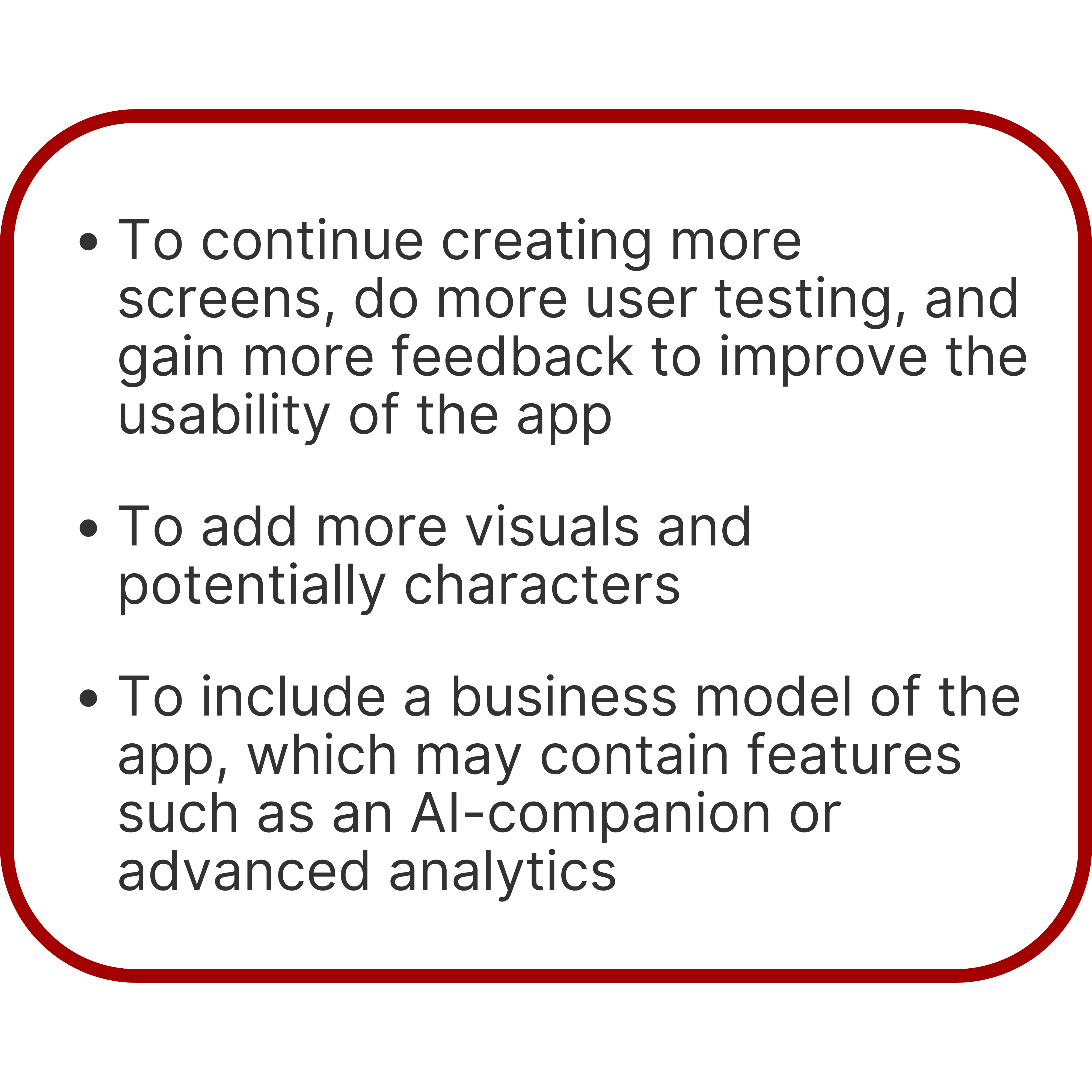
CANQuest is a gamified study app for busy students and working individuals preparing to take the Canadian Citizenship Test. This project was created during the NMED10Y3 course (New Media Senior project) at the University of Toronto. This course also requires a speculative component which is covered later on.
Note: To prepare for the Citizenship Test, the Discover Canada textbook is read, which is a 50+ page textbook containing information about Canada such as its history, geography, political system and more. During the test, there are 20 questions to answer, and 30 minutes to do so.
I conducted primary research in the form of moderated usability studies.
The goal of the interviews were to:
With 6 interviews I categorized the data into 4 theme groups and 1 sub-group. The theme groups are Study Strategies, Potential Features, Challenges, and Motivations in Playing Games.
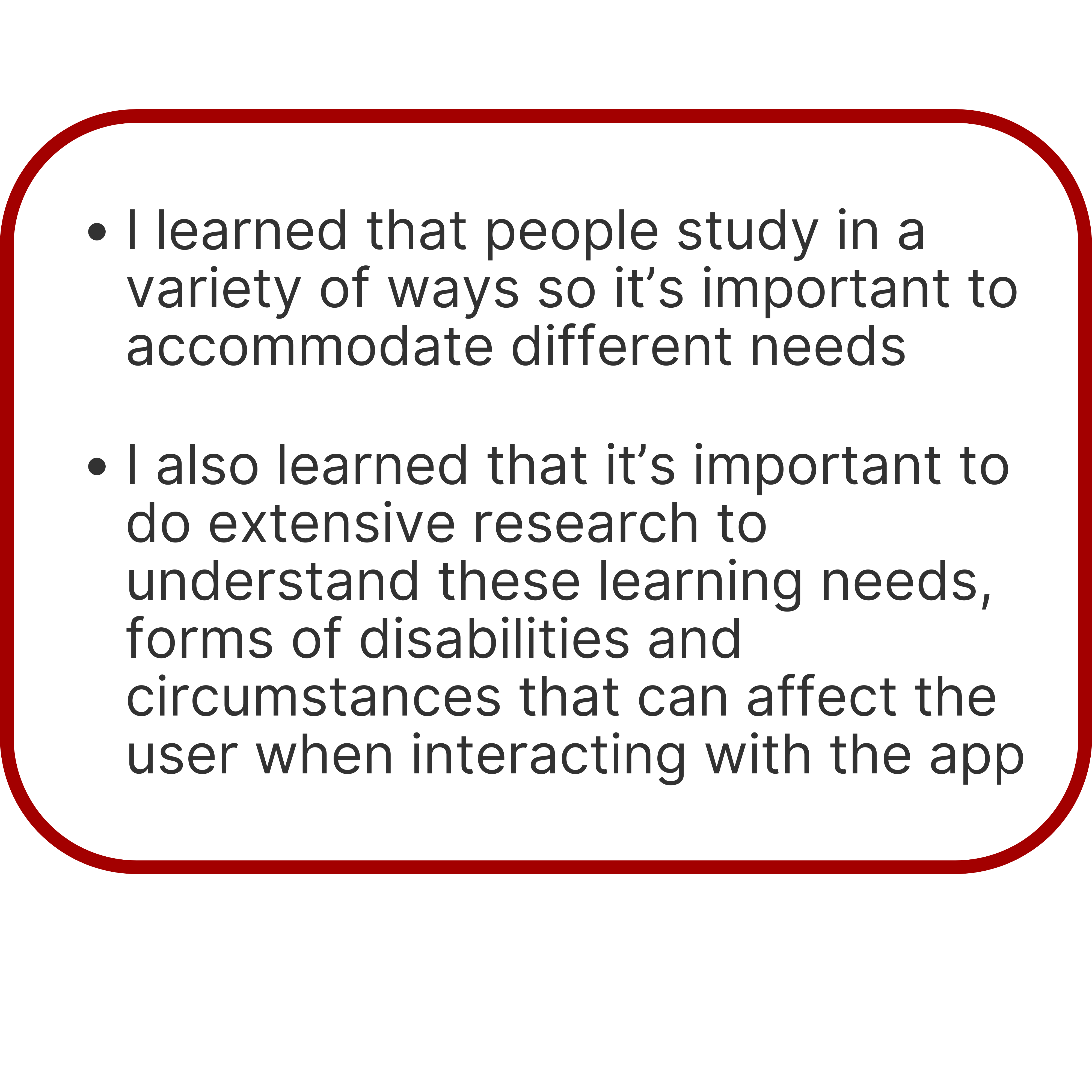
Users also mentioned some accessibility concerns, such as covering learning needs for different people, and disabilities they may have.
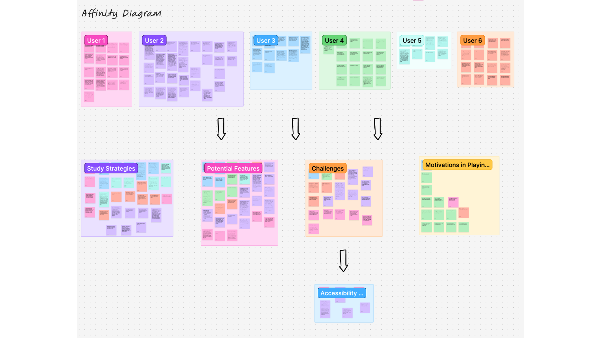
Users gave some ideas for potential features to be implemented into the app. Based on the users’ pain points, some of these features will be taken into consideration.
I wanted to get an idea of the study strategies users used to help prepare themselves for the test.
These are the 3 digital travel booking tools that came up most often in survey responses. My goal was to compare what features they had to offer in order to identify gaps and opportunities for improvement.


The process of studying for the test can feel boring and lengthy, difficult to understand, and memorizing dates can be tricky.
To create a gamified study app that addresses the study challenges, learning needs and accessiblity considerations using study methods that helps the user study in a time crunch.
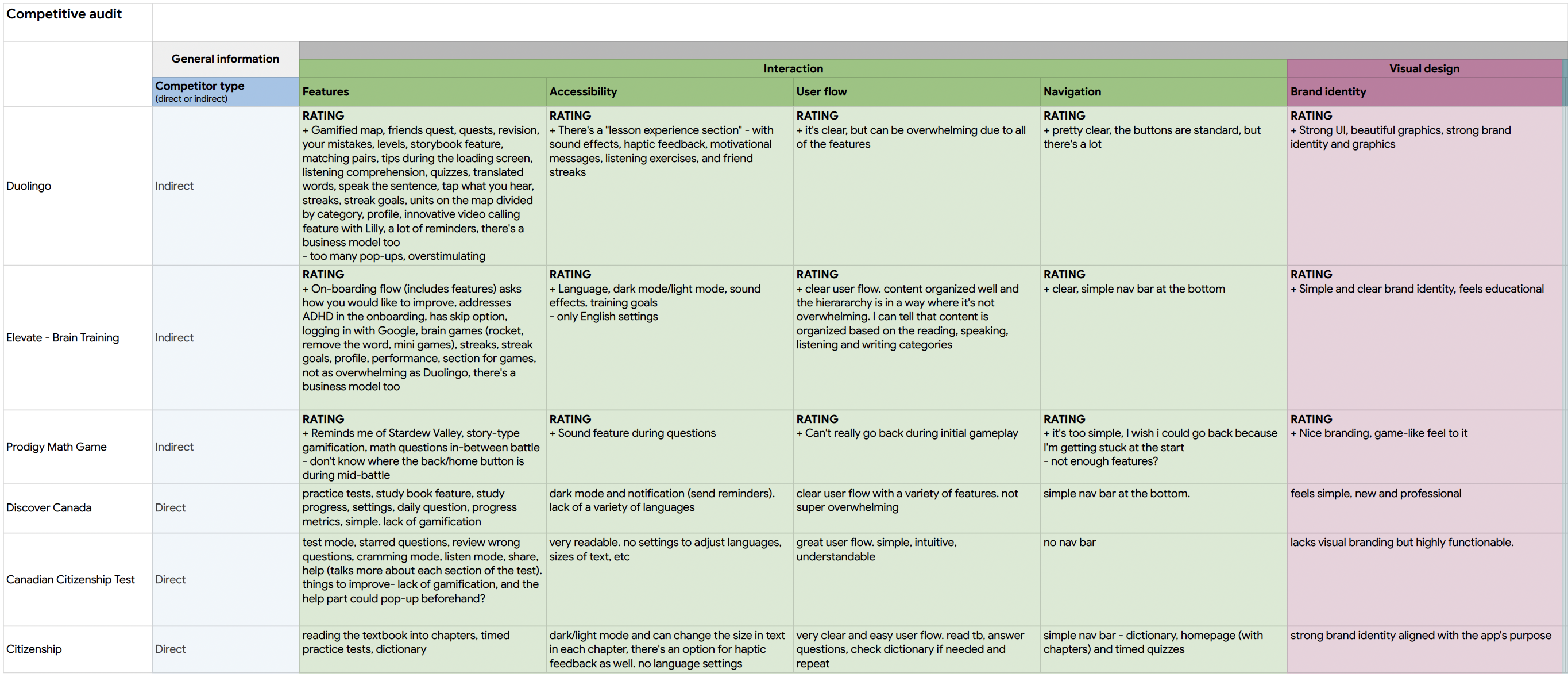
A competitive audit helped me to become familiar with various study apps and gamified features. It also helped me to identify some of the gaps in the market for existing study apps for the Canadian Citizenship test. This was having gamified features, and screens such as a map, and timeline. I looked at 6 different apps to create the audit.


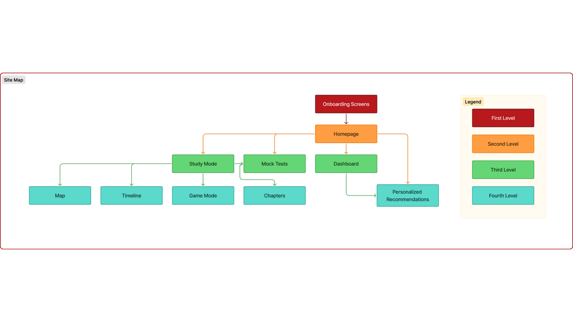
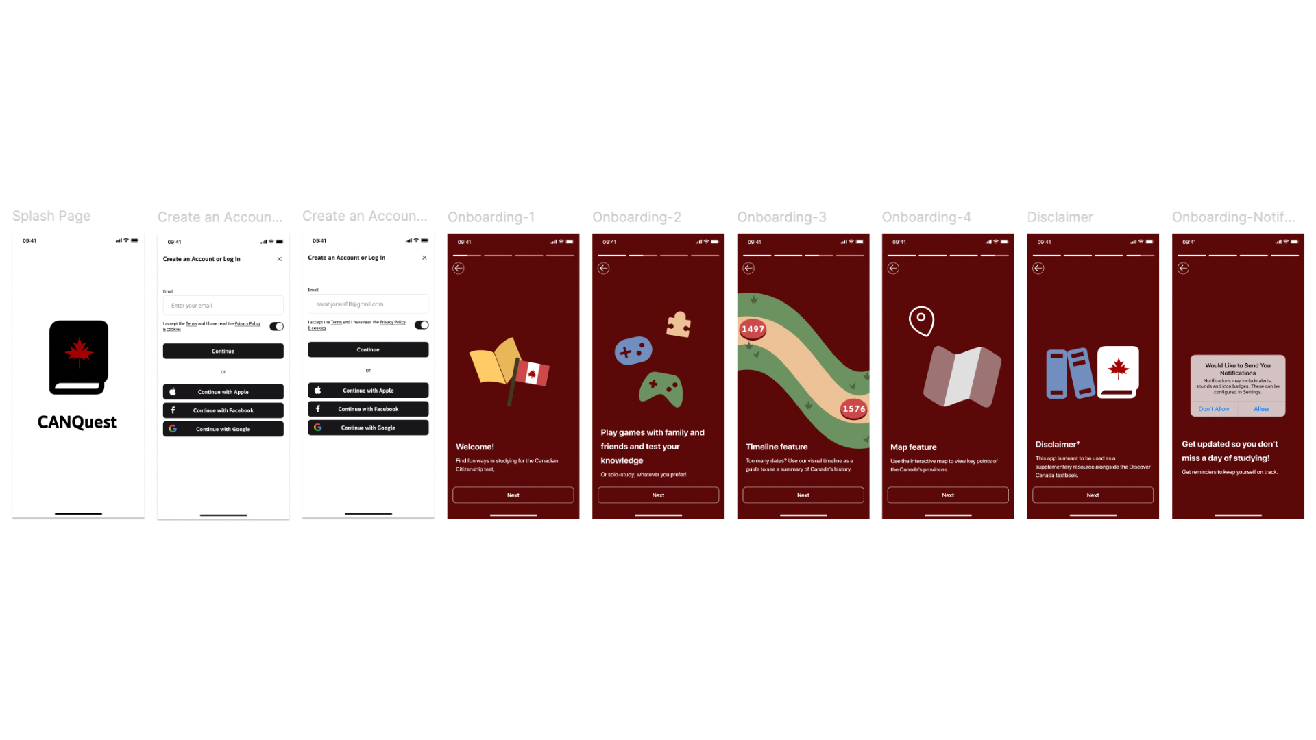
The site map consists of the current screens of the MVP (minimal viable product). More screens will be added as the project progresses in the future. This shows the hierarchy of the screens in the app.
Focusing on the core features identified during user research, I sketched the first wireframes using pen and paper.
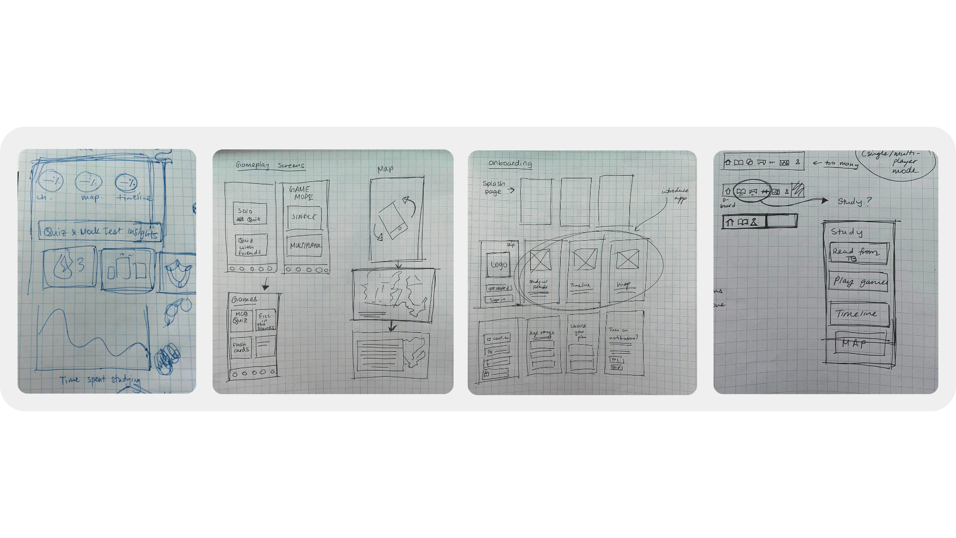
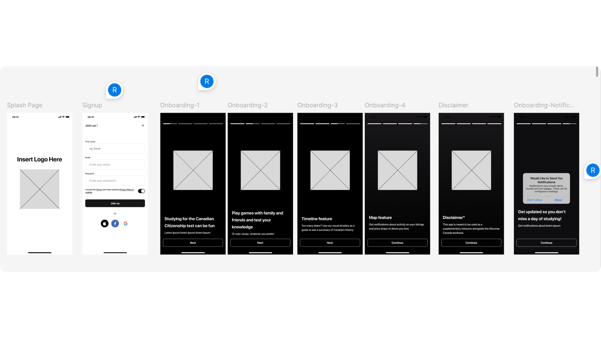
In these wireframes, I created the main onboarding screens.
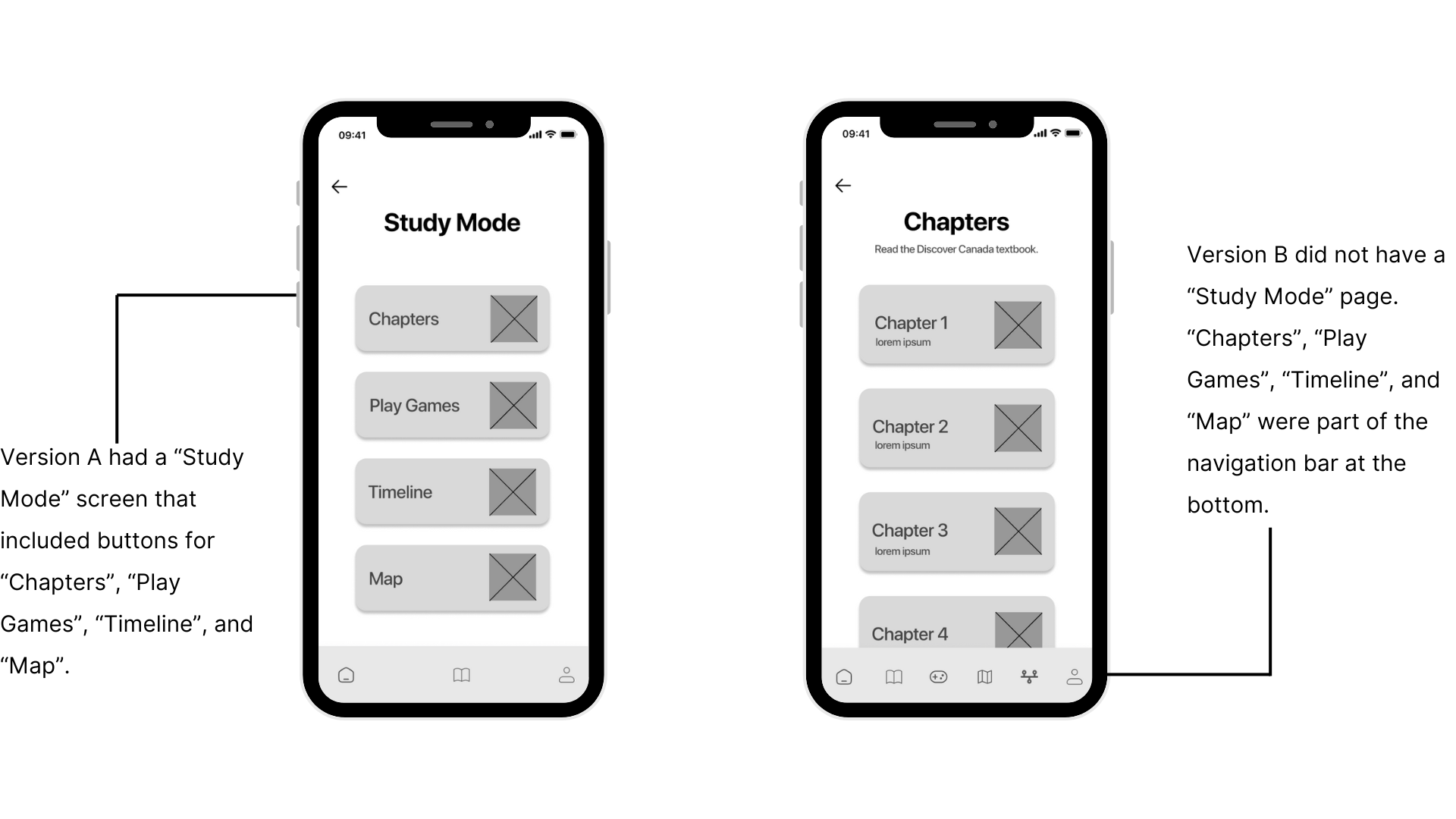
At this point of the process, I had two ideas that I wanted to test out with users. I wanted to see which version was better and more easier for the user to navigate through. As a result, users preferred Version A since the navigation was more clear.
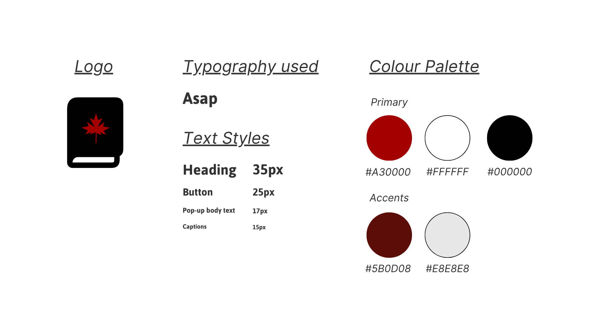
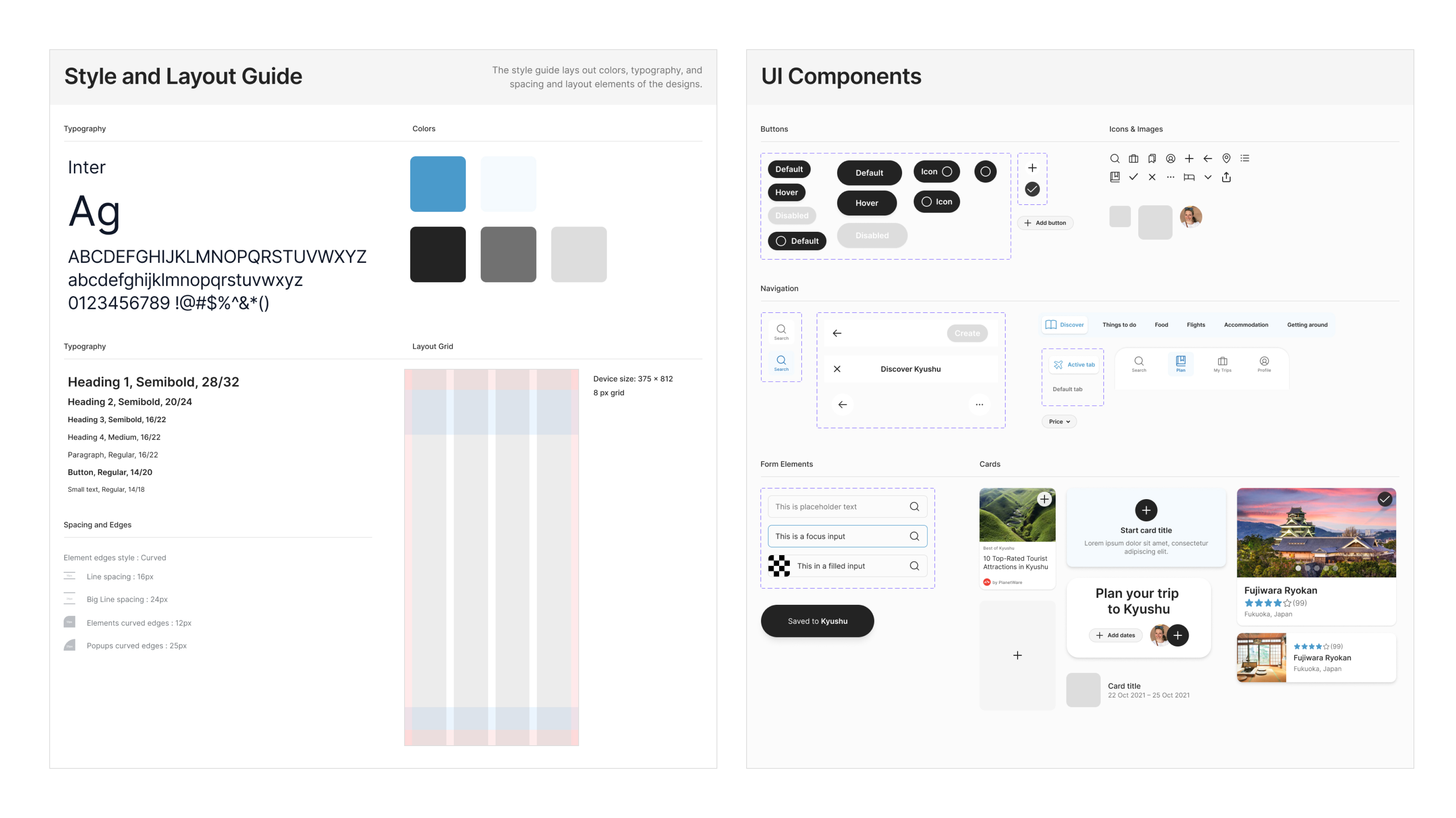
After setting up color and text styles in Figma, I started to build a component library to maintain consistency across the designs. Components were setup using auto layout to make sure they are scalable across different screen sizes.
All of these elements finally come together in the final designs. Users can search by location to create a new trip and start planning.
All of these elements finally come together in the final designs. Users can search by location to create a new trip and start planning.
Research revealed that nearly all users traveled with family or partners/friends. This feature let’s people plan trips together.
.png)
A scrolling tab bar keeps different kinds of information organized inside single trip. Users can research and plan all aspects of a trip in one place. They can come back when they’re ready to reserve.
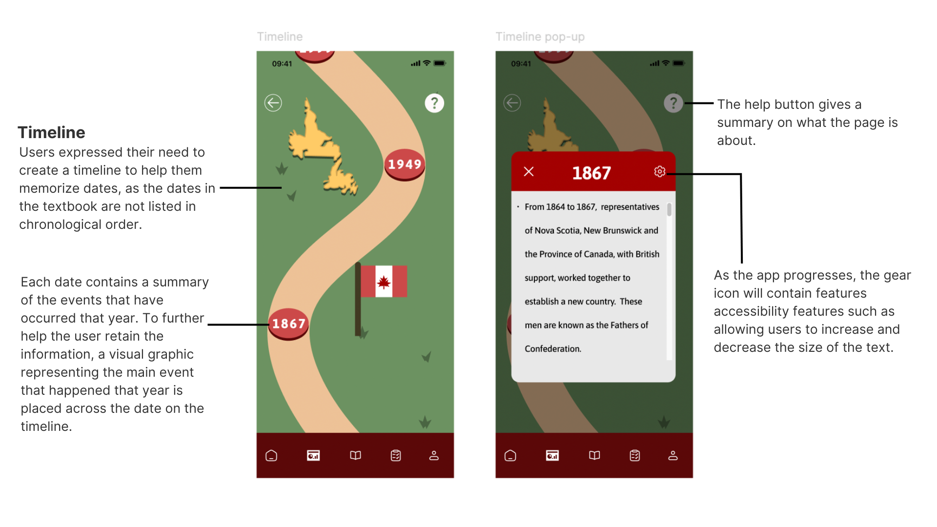
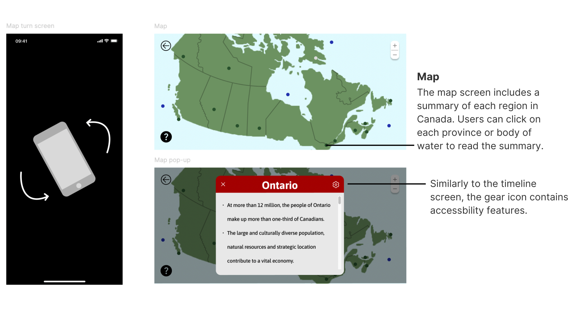
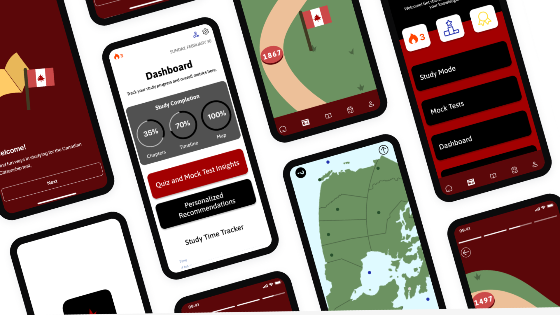
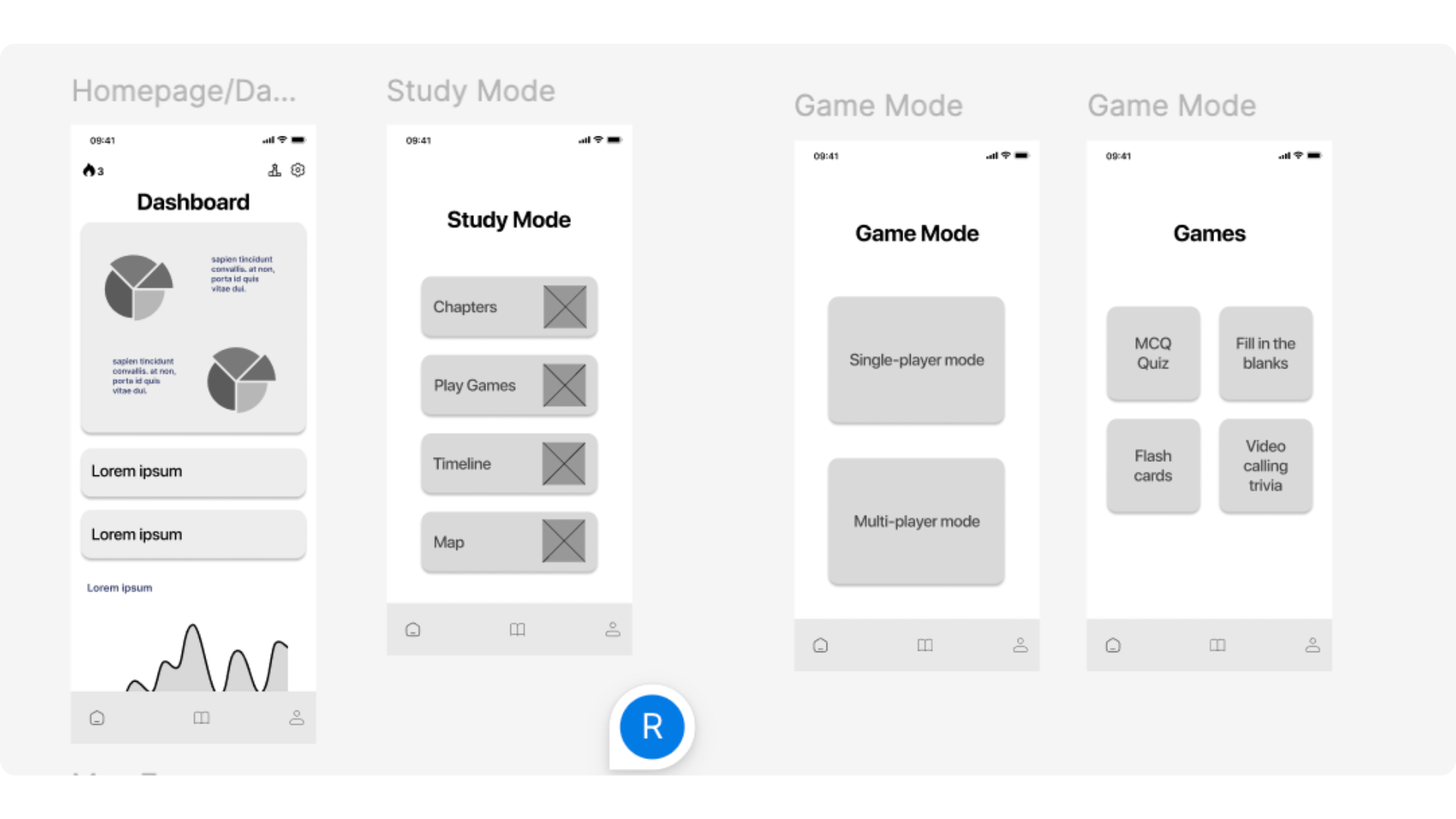
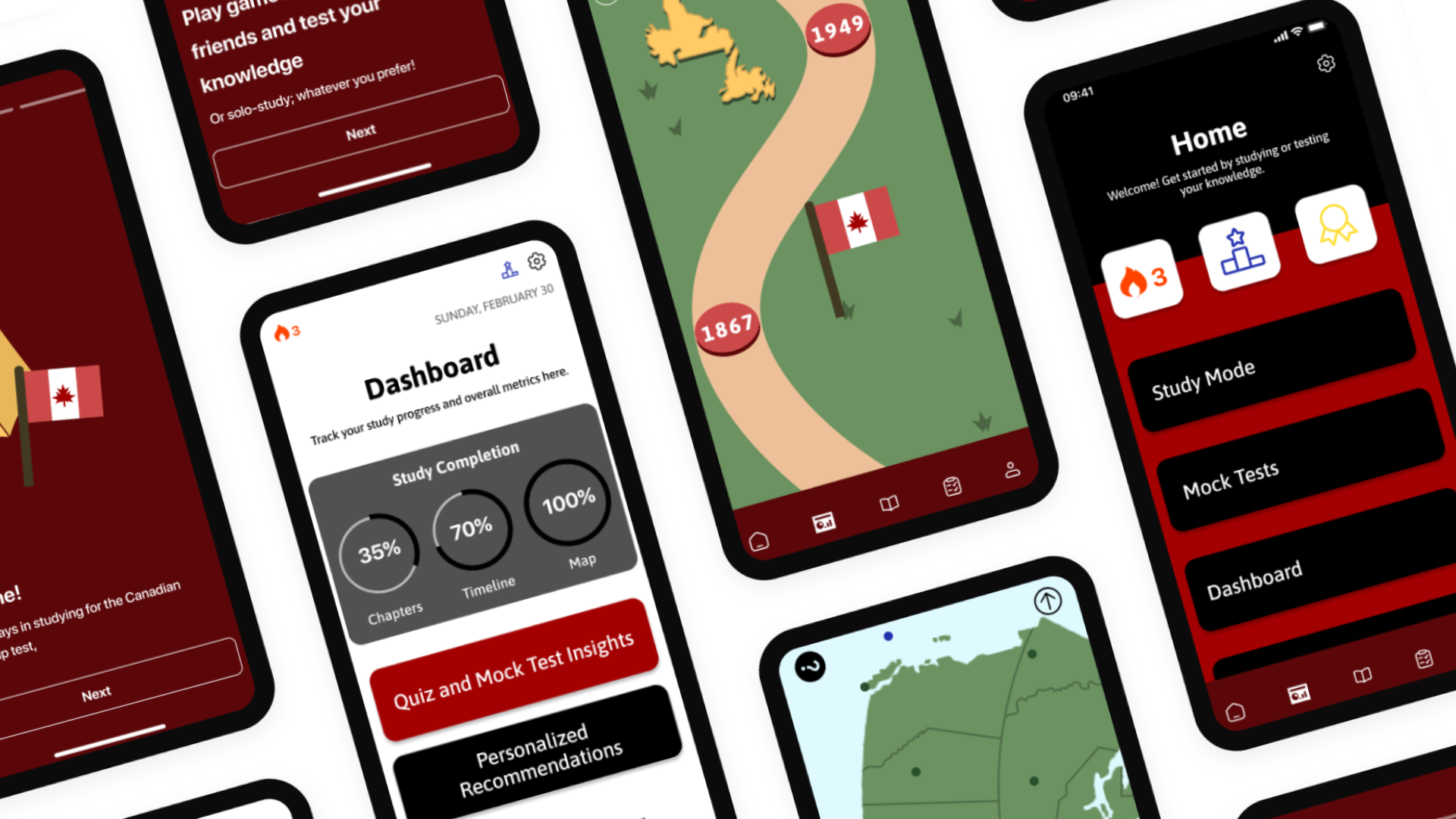
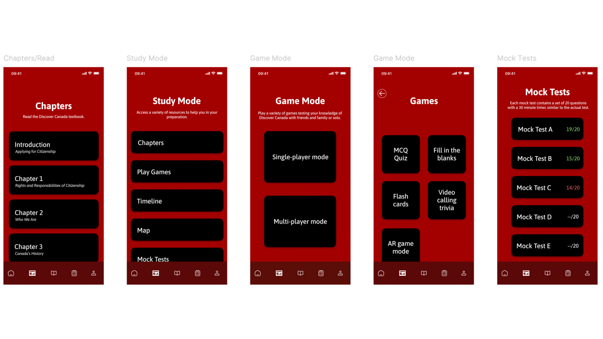
Users can learn and revise different concepts by reading the Discover Canada textbook, using the various features in the study mode, play games and practice mock tests.

Before building out the UI for each screen I made sure that my choice of colours met WCAG AA Compliance.
I am using only one typeface: Asap for headlines and body copy. Mixing too many different typefaces can make the app seem busy and difficult to read with typefaces that are not appropriate.
As the app progresses, there will be options for the user to increase/decrease the size of the text, use the app in night mode, and have to option use haptic feedback.